

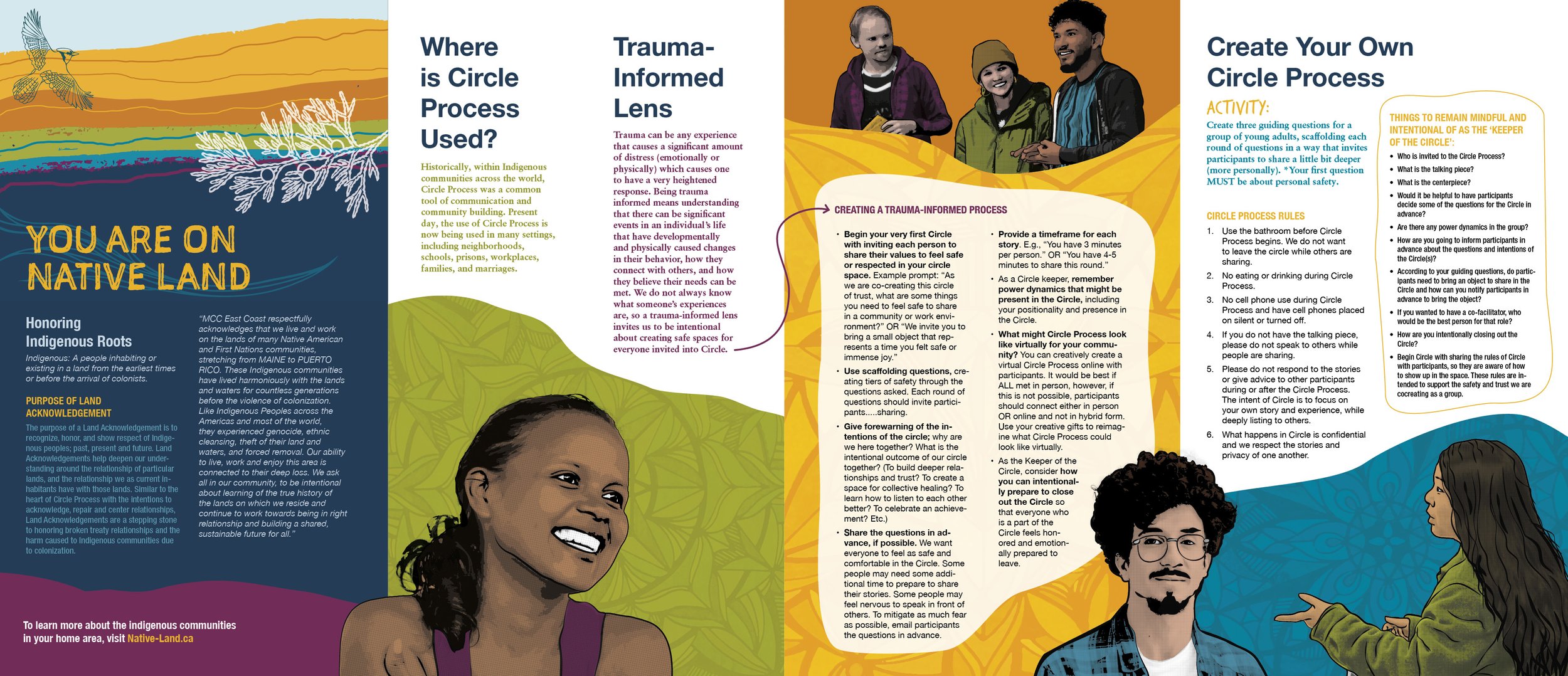
MCC CIRCLE PROCESS BROCHURE
Print and digital design | illustration | double gate fold brochure
A vibrant design for the next generation of difference makers.


The process

MCC USA East Coast wanted a vibrant new look that was designed to reach a new younger audience. The original direction for the graphics was inspired by mural and poster art found in cities on the east coast as well as mandala illustrations and patterns with bold colors. We proposed a round of exploratory illustrations to search for the right style and tone for the project that worked seamlessly with MCC’s existing brand colors. This included a series of stylized photos with illustrated elements, hand drawn illustrations, and mandalas that helped us build a richly colored and textured design concept. The final direction ended up using less stylized photos of people that were more consistent with MCC’s existing photography standards. While this was a bit disappointing on one hand, the final result was still just as effective. Graphic design work often goes this way. Ambitious creative projects will always have work that goes unused but it’s not useless. It’s all part of the process of collaborating and exploring in order to achieve the goals of the project.
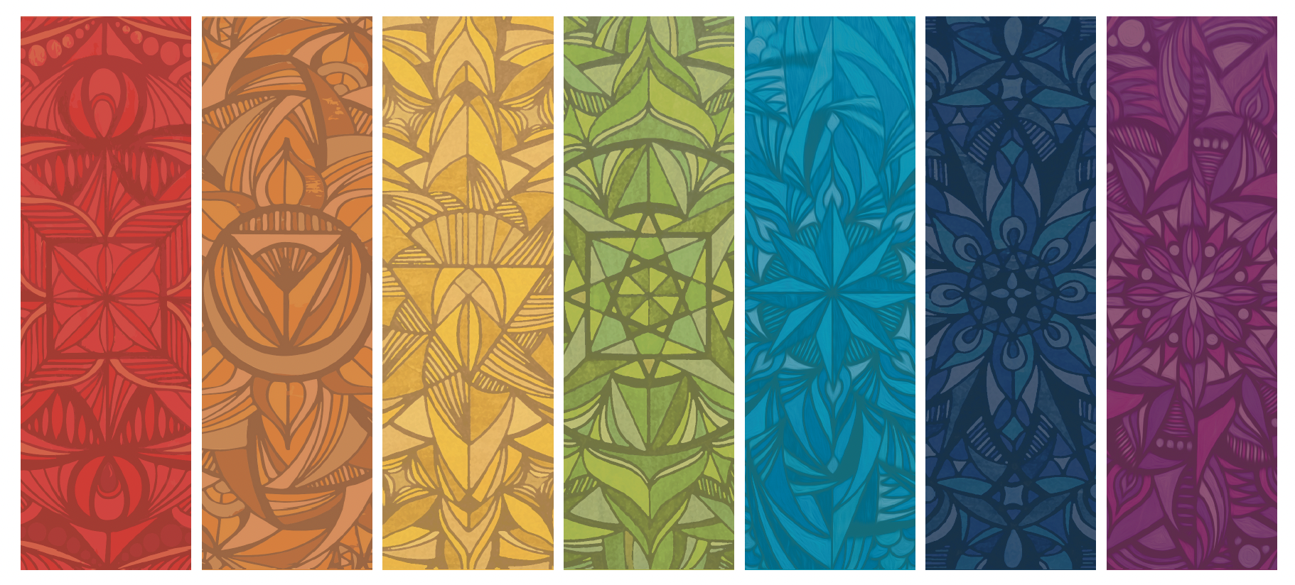
A collection of seven colorful, intricate geometric and abstract patterns with a gradient color scheme from red to purple.

Drawing of a man with curly hair, glasses, and a mustache, wearing a denim jacket.

Illustration of three diverse people standing and talking against an orange background with yellow accents.
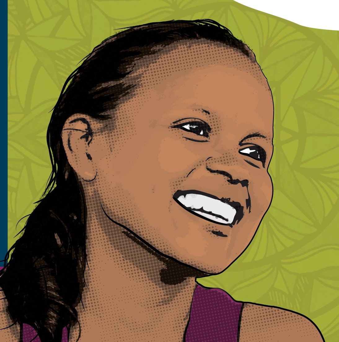
Digital illustration of a young woman smiling with wet hair and a purple top, against a green background with leaf patterns.

A digital illustration of a young person with short, textured black hair, smiling and wearing an orange shirt, set against a light blue background with abstract circular designs.